A bit more about CMS and Author Experience
Wordpress is optimized for blogging, not architectural purity or code quality. That makes it great at what it does, but tricky when you try to push it beyond those boundaries. For the Toast, we wanted to push the envelope in two specific ways. First, we wanted precise control over content recommendations to ensure readers experienced the breadth of the site’s writing. Second, we wanted squeaky-clean templates and code for ongoing maintenance by The Toast’s staff. No matter how pretty the design, they needed to be able to take long-term ownership of the code and build on it themselves.
Taming Templates with Timber
The Loop that powers every WordPress theme is familiar to anyone who’s tinkered with the system. Each page is built around a set of posts retrieved from the database, and each template is a PHP script that loops through them, turning data into PHP markup. Even the “single post” page is, at its heart, a very short loop.
While this approach is simple in theory, design requirements can quickly turn the loop into a tangle. Markup and PHP code are woven together, and special cases to handle different post formats and display styles mean most real-world templates are a snarl of spaghetti code. That also means that maintaining consistent markup across multiple templates is an exercise in discipline.

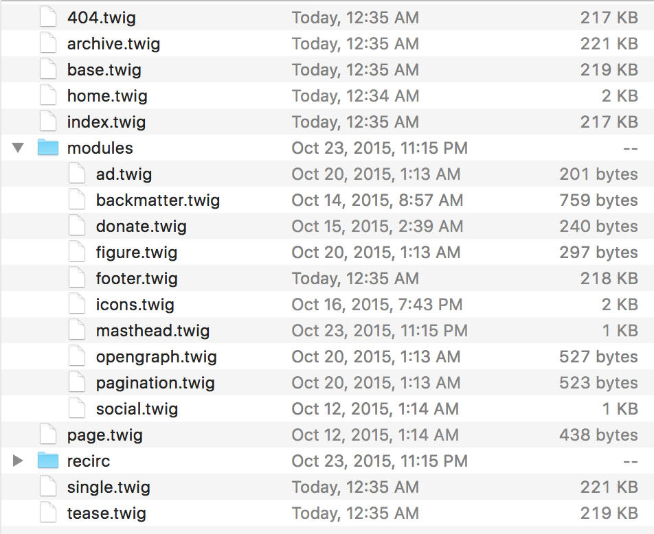
Our secret weapon is the Timber framework, a plugin that marries WordPress’s theming system to the popular Twig templating engine. It turns traditional WordPress templates like archive.php, home.php, and single.php into containers for display logic, responsible for building up information and passing it on to templates written in much simpler Twig markup. Timber makes it simple to break out recurring markup patterns into reusable sub-templates, and lets us quickly override behaviors on standard WordPress objects like posts, authors, and tags.
The resulting system actually resembles Drupal’s theming layer, where preprocess functions prepare data and pass them off to code-free markup templates. More and more PHP-based web publishing systems, including the soon-to-be-released Drupal 8, are using Twig for their markup templates. It’ll be interesting to see if this allows theme creators and front-end developers to branch out, using their skills in a more diverse array of CMSs.
Simply put, if you’re building WordPress sites, go to the Timber Framework site right now and check it out.
Streamlining the WYSIWYG editor
Developers (and content strategists) have always had a contentious relationship with the friendly, point-and-click WYSIWYG editors that writers and editors love to use. They often bury writers in options, and make it easy to create tangled, ugly markup that breaks carefully designed templates.
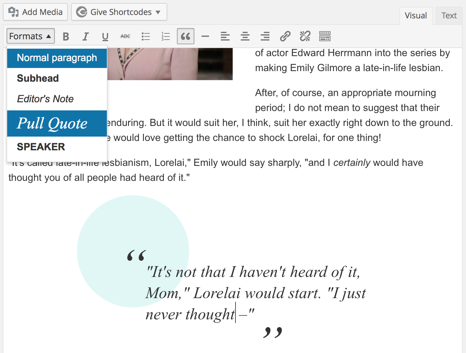
We trimmed the fat from WordPress’s WYSIWYG editor, turning off options that The Toast’s writers and editors never used. We overrode WordPress’s default media embedding shortcodes, ensuring that images and videos dropped into articles would have cleaner markup that worked with our responsive layout. We added support for a number of “house styles” like pull quotes and editors’ notes, and added CSS rules for them to more accurately reflect the site’s styling in the WYSIWYG editor itself—helping The Toast team edit more confidently.

The result is a faster, simpler WYSIWYG editor whose options match the styling that The Toast actually needs.
The Siren Song of Custom Fields
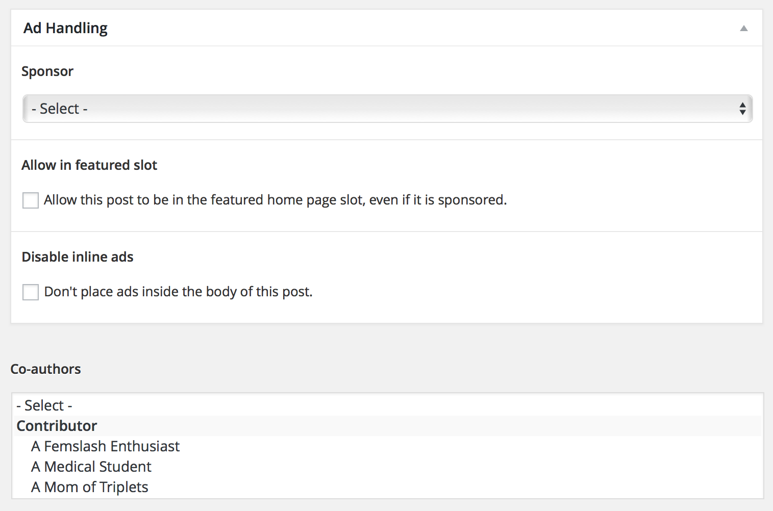
Several features in The Toast’s new design required additional information that’s not present on a standard WordPress post. We wanted to capture multiple authors for each post, credits for illustrators, attribution information for sponsored posts, and more.
CMSs like Drupal have long given developers and site builders tools to design custom content models: definining new types of content, adding fields and properties to them, connecting them with relationships, and so on. WordPress provides a way to do this, too… in a manner of speaking.
Every WordPress post and comment can be decorated with additional “meta” fields — key/value pairs that get saved and loaded along with the normal data. It’s a simple and straightforward way to tuck extra bits of information onto a post, but it has to be entered by hand and can only store simple text data.

That’s where plugins like Advanced Custom Fields come in. They layer friendlier editing widgets onto WordPress’s meta fields and do the heavy lifting of encoding complex data (like dates or file uploads) for storage. These tools can add a lot of polish to the WordPress editing experience, but it’s critical to remember that they don’t change WordPress’s underlying storage system. All the fancy fields we added were being encoded as text, jammed into the “Post Meta” table, and left for later retrieval.
This isn’t a problem if you’re only using custom field data when a post is loaded and displayed. If you plan to use these custom fields to handle complex relationships—connecting a post to multiple authors, say—the SQL queries to handle that data will be punishingly slow.
Not to beat a dead horse, but Drupal has used tailored database tables to store custom fields in an easy-to-query fashion for almost a decade. I have spoken to children younger than Drupal’s solution to this problem. While it’s possible to build your own custom plugin from scratch, with more efficient data storage, all of WordPress’s internal query tools are optimized to filter and sort on standard Meta fields. For The Toast, we worked around WordPress’s schema woes by carefully caching the results of specific queries, and picking and choosing where we’d make use of these expensive-to-run queries.
Simplifying queries with ToastGetter
Rather than showing a simple list of similar posts on each page, The Toast’s new design sprinkles each page with short lists of suggested “next reads.” These lists are smart—on the home page, they’ll point you deeper into a given author’s back catalog or a popular series’ previous entries. On an author’s archive page, they’ll shift to topically related posts to keep things varied. And on every page, we bend over backwards to ensure that popular topics or writers don’t crowd out less visible parts of The Toast’s diverse archives.
You can read more about the underlying rules, as well as the data that made them posible, in our post about The Toast’s taxonomy. Those complex rules, however, mean that using one of WordPress’s many “Related Content” plugins just wasn’t an option.
Our solution is a central helper class named “ToastGetter.” It hides our tangle of rules and filters behind simple calls to a centralized library. Centralizing these queries also means that ToastGetter can maintain a list of what posts have already appeared on a page, culling them out of any subsequent recommendation lists.
This approach also allowed us to use simple placeholder queries during early development, then add the more complex logic as we went on. Ethan Marcotte’s front-end design work could use real content on a working site, even though the rules for content recirculation were still under development.
Smart ads and promos with ToastJammer
ToastGetter simplifies the process of building related content lists, but we also needed a way to simplify putting them on the page. Traditionally, a WordPress site leaves this work up to a widget that sits in a static sidebar. We wanted reading suggestions to be deeply integrated into the content, though—slipped into the flow of archive pages and tucked into asides during long articles. Since The Toast is an advertiser-supported web site, we also needed to do the same with ads.
To simplify those two core tasks, we built a tool called ToastJammer. On index and archive pages with multiple posts, it walks through the following rules:
- First, skip over the first three pieces of content: putting related content suggestions on every post would be too cluttered and distract from the primary content list.
- If the next piece of content is in a series, pull up four other posts in that series. (Unless that series has already appeared.)
- If we don’t match a series, next try pulling up four more posts by the same author. (unless that author has already been used to create a “More by…” recommendation list.)
- If we don’t match an author, pull up four posts that share as many tags as possible with the current one.
- If we can’t match four tags, look at the category and find four posts in it.
- Finally, if that doesn’t produce enough posts, move on to the next post and try again.
- Once an appropriate list of four related items has been found for a post, jam them underneath the post and take note of their IDs, excluding them from any subsequent recommendations on the same page.
- Skip three articles again, and continue the process until the entire listing page has been populated with content suggestions.
Different types of pages can exclude or change the order of those rules; the author archive page, for example, doesn’t use the “More by this writer” rule. ToastJammer wraps each step in its helper functions, simplifying the code that generates each index page and ensuring that the rules driving The Toast’s content recirculators stay consistent. It’s a complex process, consumining the majority of our backend “performance budget,” but the end result is a diverse mix of content on every listing page.
For individual article pages, we manage the flow of related items in a different way. Like many web sites, page views and ad impressions keep The Toast’s lights on. In-depth posts—the kind that weigh in at 3000 or 4000 words—are often broken up into multiple pages to ensure that enough ads are displayed. Although the economics make sense, it can disrupt the reading experience and frustrate readers on mobile devices. Ever opened up an article before hopping on the subway or going offline… then discovered you only downloaded the first page? We hate that, too.
Instead, the Toast’s new design publishes every post as a single unbroken stream on its own page. Ads and content recommendation blocks, rather than living at set locations on the page, are sprinkled throughout long form articles. The longer the post, the more space there is for inline promotional content. ToastJammer has a set of internal rules governing how long an article has to be before items are inserted, how many words it should skip before inserting another one, and what HTML elements it should avoid. If it encounters an image or a pull quote, for example, it will skip ahead and give that section of the article some breathing room—ads should live in the pauses of a story, not compete with the content.
A Very Nerdy Migration
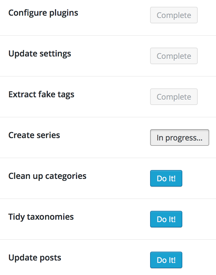
Whenever a content-centric site is redesigned, there’s bound to be restructuring. Our article on taxonomy issues covers a lot of the work that was involved, but other clean-up tasks needed to be performed before launch, as well. Old posts needed default values for newly required fields, Series needed illustrations uploaded, and so on. Rather than walk through these steps manually, we built a simple WordPress plugin whose only job was to march through the content tweaks, calling WordPress API functions to perform the actions in our stead.

Drupal developers will probably recognize this approach: it’s especially common on sites that use the Features module to capture their configuration settings. Although WordPress doesn’t have as many tools to streamline the creation of these upgrade plugins, the underlying technique still works. Once we’d captured all of the actions in code, it turned what could’ve been days of manual labor into a few minutes of waiting.
Wordpress Is A Land of Contrasts
As someone who’s been working with web content management systems since the mid 90s, WordPress is both impressive and frustrating. The development team at Automattic has focused relentlessly on the experience of blogging, and helping bloggers keep up with the new features and technologies their sites need to stay visible.
That focus on user-facing features and polish, though, has left WordPress’s internals in a somewhat… janky state. The sorry state of the WordPress database schema is mentioned above, but other gaps stand out as well. For example, there’s no good way to generate user input forms or to modify the operation of existing ones. That makes customizing the WordPress administration screens, especially the post editing form, an exercise in frustration.
Third-party WordPress plugins abound, but precious few give site builders and developers any way to override the HTML they generate, or to build site-specific customizations on top of their features. If they need to store any custom information, it usually goes straight into the overloaded metadata table, where simple queries are easy but complicated ones grind to a halt.
Those complaints, though, come from someone who’s used to working with much more complex products and developer frameworks. The pain points we felt while building The Toast all revolved around specific ambitious features: highly tailored content recirculation, ads and content suggestions integrated into articles without heavy client-side JavaScript, and so on. Tools like the Timber Framework helped considerably, but achieving the design’s goals required building our own solutions for many problems.
Fully Toasted
At the end of the day, we’re incredibly proud of The Toast’s new site—both its design, and the code that powers it. WordPress is a familiar, comfortable tool for many bloggers and we were determined to stick with it, ensuring the site’s existing team would have a smooth transition and be comfortable maintaining it over the long term. We may gripe, and more than a few jokes were made about WordPress’s shortcomings, but with planning and careful attention to performance it can really shine.
