
A bit more about Visual Design and Illustration
A redesign means more than just what the site looks like, but new layouts, typefaces, and illustrations are the most visible (and emotional) aspects of a redesign. Karen talked with Jenny Ng, who led the design process, and Libby VanderPloeg, who created a set of new series illustrations.
- Karen:
-
Jenny, what’s your background as a designer? What other publications have you worked on?
- Jenny:
-
I’ve been in the design field for about 15 years. I started out as a graphic designer doing print work—publication and logo design—then eventually moved into web design. I was recently a digital design director at Condé Nast and worked on about eight magazine websites including Vanity Fair, GQ, Allure, Golf Digest, and Brides magazines. Currently I’m a user experience director at Moda Operandi, an online luxury retailer.
- Karen:
-
Libby, what’s your background as an illustrator? Your style is perfect for The Toast.
- Libby:
-
I went to school for fine art—painting, drawing, and sculpture specifically. But I always had an interest in graphic design, and did a lot of work in that field after graduating, finding every which way to incorporate illustration into the projects that I was a part of. Over time my career shifted and the majority of the work I was doing was illustration. That’s when things started to click.
-
I like to make work that makes you laugh or just smile, or motivates you to think about the world in a new way, so when this project with The Toast came along, I was really psyched. Here was a chance to make something strong, funny, and thoughtful. I couldn’t think of better parameters. Also, my mom is a feminist and a librarian, so I knew she’d be excited too.
- Karen:
-
The Toast has many devoted readers, and we wanted to redesign to make it feel more polished, but also retain the personality and feel of the site. Jenny, how did you approach that problem?
- Jenny:
-
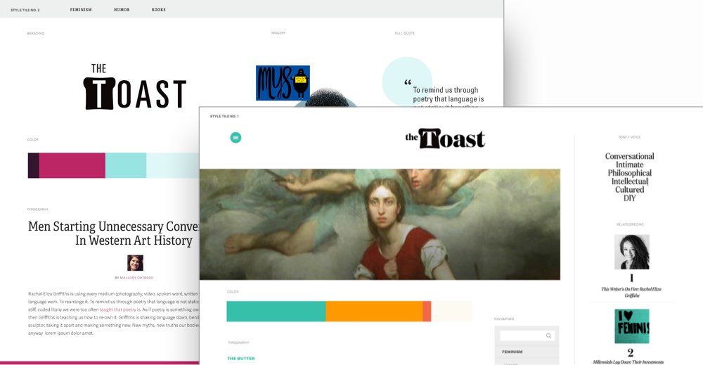
The Toast’s style is conversational, smart, and humorous. In giving the site a refresh, it was important to acknowledge what worked well for them. I wanted to ensure that the visual design reflected all of the above, while keeping certain aspects of the DNA—for example the color palette still has the teal and orange, so The Toast remains recognizable to its readers.
- Karen:
-
What’s your process for coming up with design concepts?
- Jenny:
-
Before any real design was done, I created several moodboards that explored The Toast’s look and feel, through a system of typography, photography and illustration styles, and color. This process enabled us to see the design possibilities in a holistic manner.
- Karen:
-
Tell us about the typefaces you chose, as that’s one of the most noticeable changes.
- Jenny:
-
The right typefaces can do wonderful things. The heading serif is called Domaine, which I think exudes bold femininity with its elegant strokes. At large headline sizes, it is confident and very legible. The sans serif body font, Proxima Nova, is crisp and easy on the eyes. Both of these are not super typical of publication websites, so that also helped to differentiate the The Toast from others. I love the crispness of the design and how legible it is now.
- Karen:
-
Are there any other design elements you really love?
- Jenny:
-
Illustration can help establish a voice. I enlisted my friend, Libby, to create some new illustrations. Without question, her style hit the nail right on the head and the results were fantastic. I hope to see The Toast use more of these illustrations for their marquee series.
- Karen:
-
Libby, what was your process for coming up with illustration concepts for each series?
- Libby:
-
I like to go to my favorite coffee shop with my laptop and a notebook to do concepting work. Something about expensive coffee drinks makes my brain more creative.
-
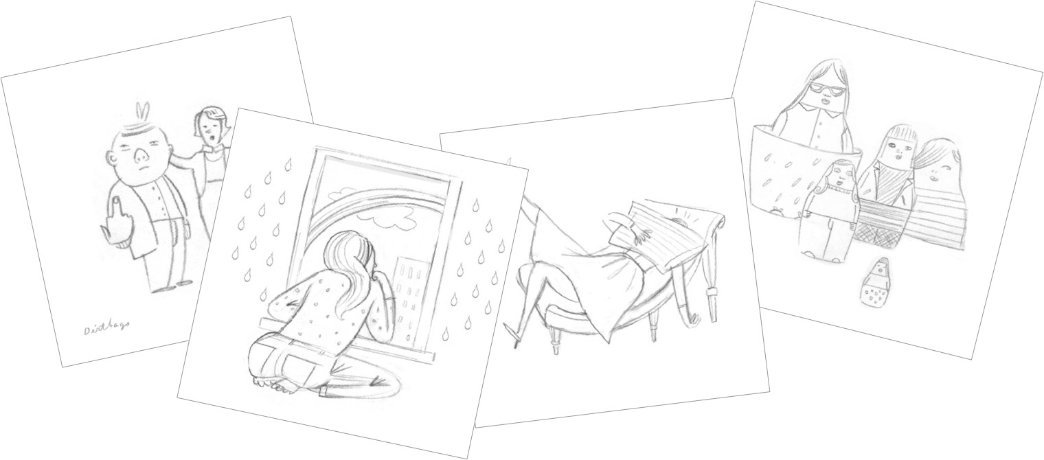
Nikki sent me a list of ten editorial categories, descriptions of what those categories encompassed, and editorial samples of stories that would fall into those categories. So I started digging through all of the writing samples she sent me, and pretty much just let my imagination run from there. I made a list of possible ways to illustrate the respective categories, and then narrowed down my favorite concepts.
-
I also had to factor in the scale of these illustrations—400 pixel square doesn’t give you any room for superfluous details. The ideas had to be clear, but nuanced. I worked up pencil sketches next, providing a few options for some of the categories, but for most of the topics I showed only a single iteration. Some ideas just felt right from the moment I met them.
- Karen:
-
You may not want to admit this, but do you have a favorite?
- Libby:
-
My favorite, hands down, is the nesting dolls [used for all community series: Open Thread, Toast Points, and Link Roundup]. I love the colors, the energy, and the idea of it. When I was concepting all of the series, I kept putting that one off, until all of the other ideas were locked down. I had no clue what I should do for that one! I had to stare at the wall for an hour and just start doodling to get to where I went with it. I think it started as a line motif—a sort of abstract design—and then I started seeing the shape of the doll, and then the idea sparked. I loved having this chance to design my own set of modern nesting dolls, all with their own unique personalities and styles. In fact, I really want to start making dolls like this! I love the goth-y girl with her sturdy, fish-net stocking’d legs.