
A bit more about Redesigning The Toast
Who among us has not wanted to pretend like we’re friends with Nicole and Mallory? We make websites, so we figured our best shot for insta-BFF status was to offer our services for a site redesign. Like Mama always said: the best way to build friendships is through conference calls and Basecamp posts.
I have worked on web redesigns for NY Times, The Atlantic, Fast Company, many more… and my dream project is to redesign @TheToast
— Karen McGrane (@karenmcgrane) June 9, 2015Time from sending that tweet to Nicole saying “Hey lady, let’s talk” was about 12 hours. Dreams really do come true, everyone.
Since we’ve taken Toast readers’ home on the web, moved the furniture around and redecorated it, we put together a little tour of all the things we hope everyone will love even more now. For web designers who are not (yet) huge fans of The Toast, we’ve put together an even more detailed look at taxonomy; content modeling and design patterns; visual design and illustration; responsive design and performance; and back-end implementation.
As if that’s not enough, we also recorded a Responsive Web Design Podcast about The Toast.
Improved get-lost-ability
The brief for this project was that readers would easily be able to waste enjoy an entire afternoon browsing The Toast. You’ll find many opportunities on the new site to look at related or popular content. Publishers call this “recirculation” so we call those modules “recircs” even though we feel dirty admitting that.
Recirc modules are populated by magical elves who traipse into the garden of previously published content and pluck out the perfect stories to present to you. Each related content item will be exactly the thing you want to read next.
Hahahaha we can’t believe you fell for that. Recirc logic is straight up robot algorithms, heartless and soulless. Also brainless. We’ve done our level best to make them seem smart, but occasionally you might wonder: “Why are they showing me this?”
You’ll see lots of different ways to find related content:
-
Most Popular
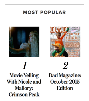
On the homepage and article pages, this will show the most popular posts from the past week. -
Active Now
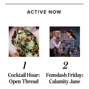
Want to jump into the fray on posts that are currently getting comments? This shows posts with the most recent activity. -
More in Series
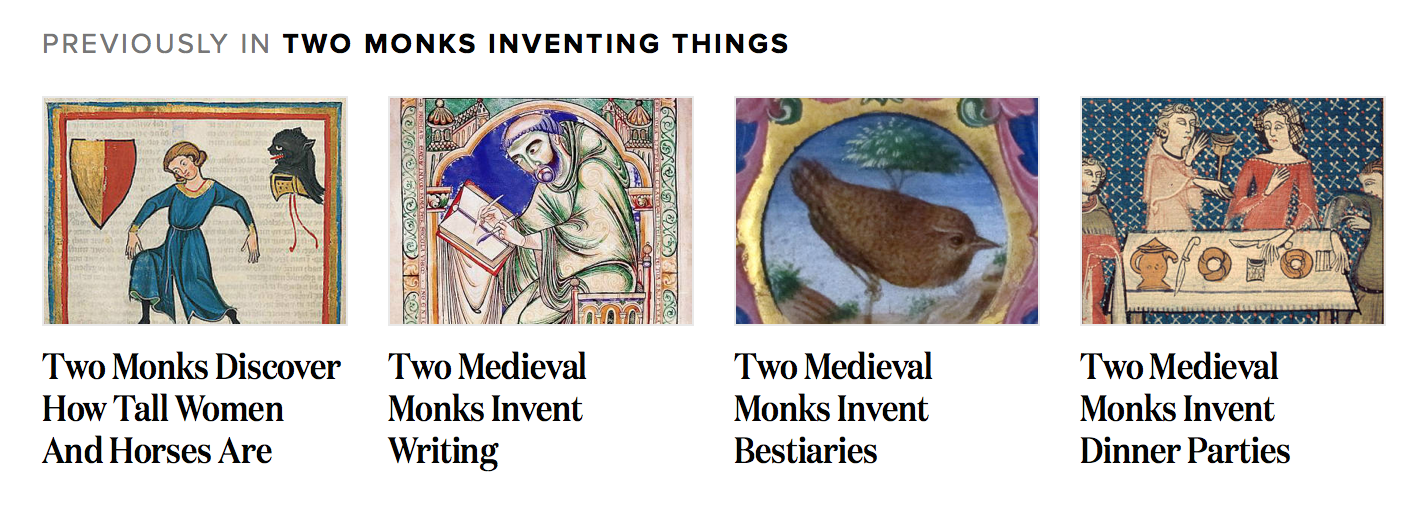
If you’ve ever wished you could just keep clicking on posts like “Two Monks Inventing Things” or “A Linguist Explains” we’re here to make that easy for you. -
More by Author
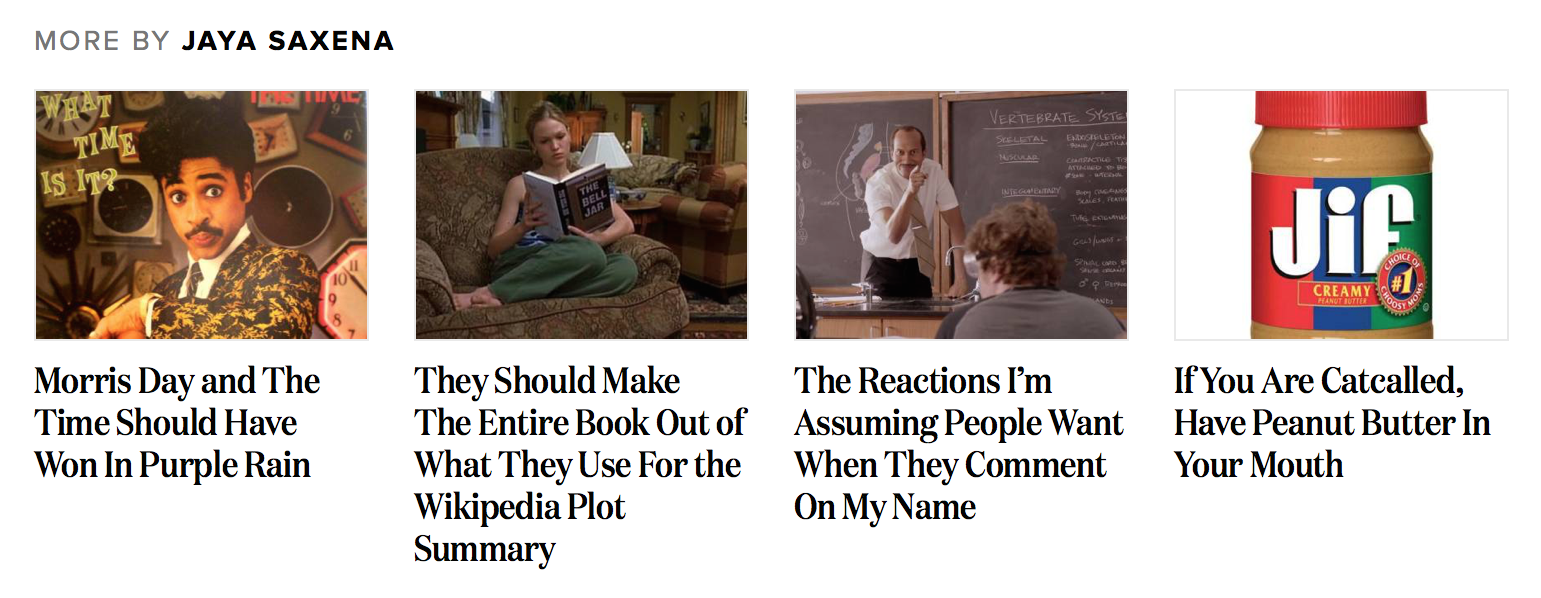
If you liked one article, you might like another one by the same author. At the end of article pages and sometimes within the main feed, you’ll see other recent posts from the same person. -
More in Category
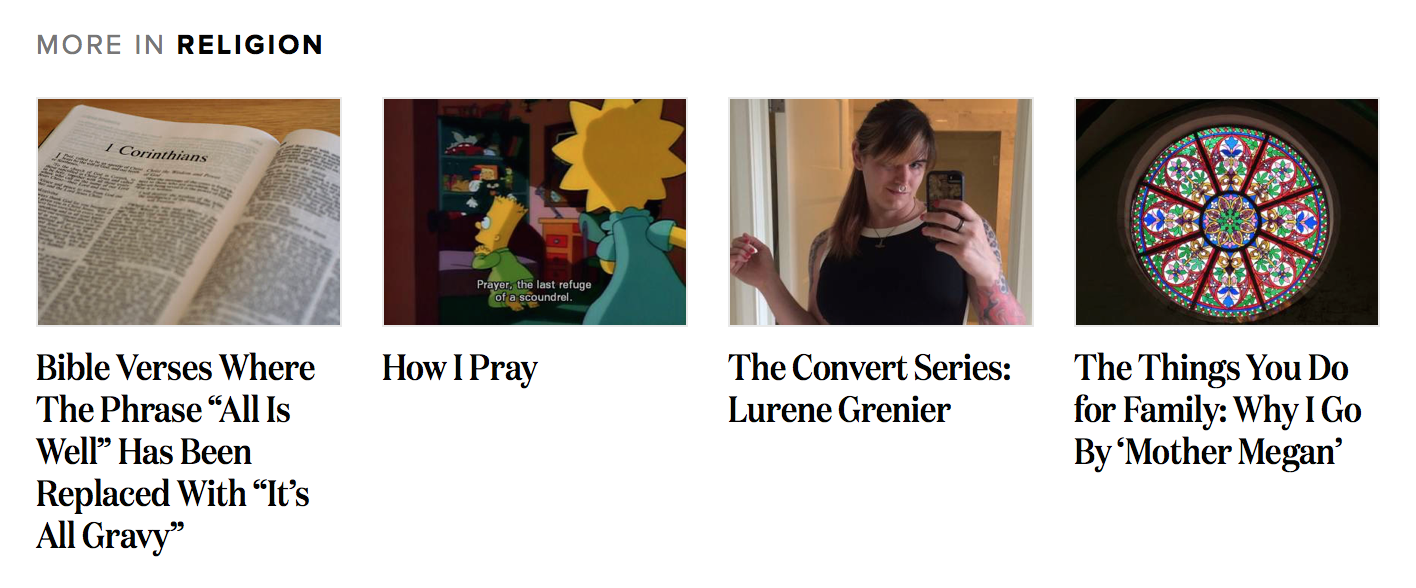
On each post in the feed, you’ll notice a big, top level category like “books” or “humor.” Sometimes we’ll show you more from this category in the feed or at the end of an article. -
More from Tags
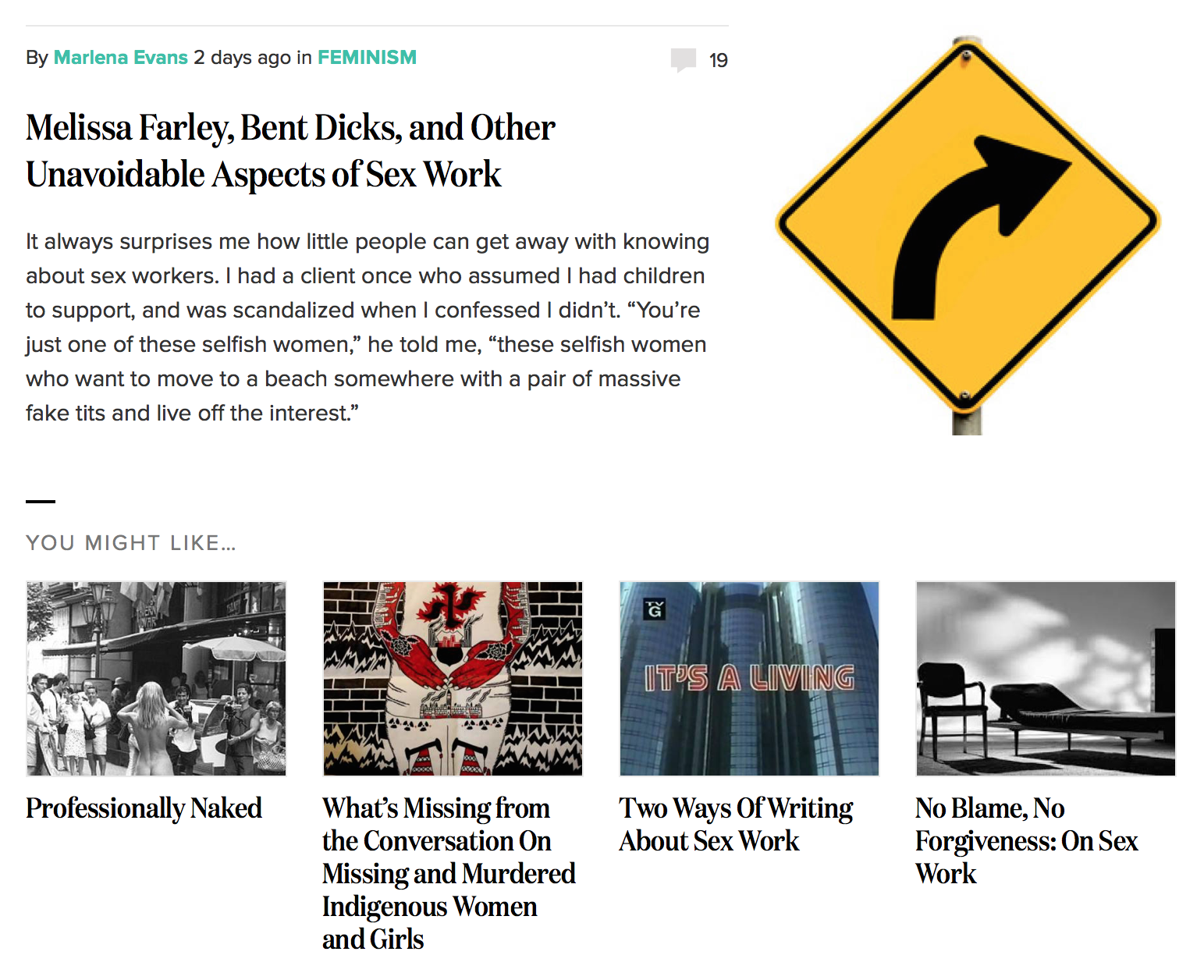
You’ll find this eerily prescient or just plain weird. If we find stories that match the same combination of tags, like “sex work” we’ll show them with the heading “You might like.”
If you’re dying to nerd out on all the details about how this works, Eileen is your people and we’ve written more about taxonomy and recircs.
Lightning-fast on every device
Mobile, mobile, mobile! If there’s any platform that should whine about not getting enough attention from The Toast, it’s mobile devices. We know many of you are finding articles through Facebook and Twitter and reading the site on your phones.
The new site uses something called “responsive web design” to make a single website that works on every size screen. Ethan seemed really attached to the idea of building a responsive site so we figured, sure! Your far-out idea just might work! You can see this so-called responsive web design in action by resizing your browser window on a desktop computer, or simply read the site on most any device of your choosing.
You’ll find that the site is much, much faster everywhere, but especially on mobile devices. When we looked under the hood of The Toast we found a family of mice, some moldy pizza slices, and several wadded up old newspapers, all of which were gumming up the works. We swept away all that cruft—the mice were gently relocated to a sunny field—and as a result the site now loads much more quickly. In fact, you’ll find articles load before you even click on them! We hope this encourages you to stay on The Toast at all times and never visit any other websites.
Ethan is concerned that this promise of “web pages that load before they are clicked” is wildly inaccurate so if you’d like the real story, he’ll tell you more about responsive design and performance.
Better reflects the inner beauty of The Toast
Has your child ever cried for days because you got a haircut? Redesigning The Toast required a gentle touch. We want this to feel like the same site you’ve always known and loved, but better.
We put most of our energy into designing reusable styles and patterns for The Toast editors. We’ve made it easier to enter and style posts, so they can spend less time futzing with WordPress and more time on writing and editing. Styles like block quotes, pull quotes, editor’s notes, and even interview formatting should be easier and look snazzier. (If you’re so inclined Karen has written a rant about content + design.)
We’re excited about the gorgeous typefaces we chose, and we hope you are too because fonts are expensive. The new typography is maybe the biggest change you’ll notice, and it makes the site way easier to read. We kept the same color palette from the old site, so if turquoise and orange are your favorite colors you are in for a treat. We also kept the same logo (we know you’re attached to it) and if you look real close, you’ll see the champagne glasses from the background made it into the new site too.
Maybe the most exciting is the new set of series illustrations we’ve commissioned. Gosh, we love them. We’ve identified 55 regular series—like “Western Art History” or “If X Were Your Y” but only have illustrations for about 10 of them today. We’d love to collect the whole set!
We asked designer Jenny and illustrator Libby if they’d answer a few questions about the new site, and they graciously agreed.
Same old janky technology as before
Toast commenters! Have you been waiting to hear what shiny modern commenting platform will replace IntenseDebate? It is IntenseDebate! Similarly, we’ve stuck with WordPress for the publishing system.

wordpress.gif. No reason.
As much as we might have liked to tear The Toast down to its foundations and rebuild it from scratch, doing so is both complicated and risky. We quickly elected to stay on WordPress to make the work of The Toast team easier. We slowly and regretfully chose to remain on IntenseDebate, after concluding that no other platform would offer much of an improvement, given the work it would require to migrate all the comments over. (Our main goal was to not lose any of the existing comments—you all are the beating heart of this website—so IntenseDebate had a leg up in these negotiations.)
IntenseDebate has been abandoned by its creators so we doubt anyone out there is sad we’re talking smack about it. WordPress partisans abound so if you want to grab some popcorn and watch Eaton take on WordPress, he’s describing its benefits and drawbacks to people who know Drupal.
More money, fewer problems
All these changes are designed to make The Toast more attractive to advertisers, too. A slick new website with more integrated ad placements across every screen size should help attract more refined sponsors, which means fewer bizarre redirects to the ad store. (If that keeps happening, let us know—in today’s modern world of ad tech, we often can’t control which ads show up, but we can try to shut bad ones down.)
Advertising on the web is a hotly debated topic right now, and we understand that some readers choose to make websites faster and less intrusive by using ad blockers (we use them too, to be quite honest). The revenue from this website is almost entirely derived from advertisements, but it doesn’t have to be that way! If you like what we’re doing, please consider supporting The Toast.
Your friends, the redesign team